Pocket PC User Interface
Ten Commandments
(Dos & Don'ts)

Overview
by Bill
Shadish for Pocket PC Magazine
Let's say that you are in charge of a new Pocket PC project. Let's also say that you even have the budget to carry out this project!
You already know the fields that are required; the data rules, and all of the hooks to other applications. Now you are getting ready to lay out the actual screens.
The owner of your company (who came to power during the early MS-DOS era), has strong feelings about what should go where, and how it should look. The software developers have their own ideas too. And if that wasn't enough, the fun-loving group of users, for whom this application is being built, have their own very distinctive thoughts about the way things should look.
Part of your job is to provide suggestions/standards that everyone will agree upon.
But, where, oh where, do you start?
This article is for those who are managing
handheld applications. What follows are
some guidelines that you can use when deciding how your new handheld application
will look and operate. The tips that are related to navigating around the PDA are marked with a  icon. The look and feel tips are marked with an
  icon.
icon.
This list is not exhaustive. In fact, there is an opportunity below
for anyone reading this to provide additional thoughts on this topic to make this more of a living document..
In the Beginning
Long ago -- IBM defined common user access (CUA) guidelines to provide
a standard for developers to follow when designing screens. Many of the good points of CUA can assist
us today. For example, one of the CUA standards requires a developer to
pop-up a Dialog Box (confirming the user's intentions), whenever the user
tried to delete a record. There are thousands of users over the years
who were Quite Happy to have had a second chance to change their minds
as a result of this standard.
Below are 10 things to consider when creating your own PPC app.
1. Thou must Chooseth between Scrolling and Paging Navigation. ()
Whether you are buying or building your application, one of the biggest user interface questions that you will need to answer is the model of page navigation. The scrolling method (which acts like a long web form, that you navigate up and down with the scroll bar) maps well to web, Word™ or Adobe Acrobat™ content, but can be annoying to users who are forced to move the PDA screen up and down to work with it.
But more importantly, beyond being a simple annoyance -- users also tend to forget what they can't see. Entry fields that are buried down off the screen will likely be skipped by the user -- at least until your page-turning logic pops up an error and sends the (now annoyed) user back to the fields that were skipped.
An alternative navigation method is to tab controls if there are a only a few sections (screens) per record. Or, if there are a lot of sections, use [Prev][Next] buttons, or even  buttons at the bottom of the form, which direct the user to the next piece of information to enter. Using this model, a screen's worth of information is never longer than the display area provided by the device. These navigation controls will take up a little bit of real estate on the screen but they are also useful in that they can be disabled until all required information has been entered on a given form. This provides a sure visual sign to the (now less annoyed) user that they have correctly filled out a screen before they try to continue.
Note that one drawback to the Prev | Next approach is that screen size will vary across devices, which generates some extra work for the developer.
Navigation Styles
2. Thou Shalt only use one font, and only 1 or 2 Different Font Sizes. ()
Ah, this is the first place that developers head
for, when playing with a new environment. You will see italic fonts; 3 or
more sizes of fonts; bold fonts; normal fonts; humorous wing-dingy fonts -- generally more
fonts than you can shake a stylus at.
A good rule of thumb is to use no more than 2 font sizes in your application
and preferably only one; using bolding to differentiate between types
of fields like labels and entry text. It is also fine to have an additional very small font for
things like copyrights, at the bottom of the pages.
3. Thou Shalt
use Only a Couple Colors. ()
This is the second place developers turn to, when
tuning up their skills on a new platform. Expect to see colors, colors
and more colors in the first iterations of applications.
More than 2-3 colors of text on any screen (including black), tends
to confuse users more than helping them. The very same limit (of the
same exact two to three colors) should be enforced across your entire
application -- and possibly across your entire line of products.
Extra tip: Remember that there are colorblind customers in the real world.
Colorblind customers would also like to be able to use (Read that: Buy!) your applications from you. If you
count on colors to differentiate sections of the screen, you
will be disenfranchising the colorblind user.
4. Thou Shalt allow
Chubby Fingers to Operate a Touchscreen. ()
We know that a stylus can be used to operate a PDA.
This allows you to tap on a relatively small area of the interface in order to select something. This fact has given many developers an unwritten go-ahead to jam and
pack as much as possible onto a given screen (see below).
Beyond creating an unwieldy looking screen that can send folks into
a cross-eyed fit, it also prohibits users from doing the unmentionable
(that is, to use their fingertip to select things on the interface). Yes
Virginia, humans do sometimes wish to enter in a few quick PDA thoughts,
without having to struggle with getting out the stylus to do so. Besides,
this allows for one-handed operation so that you can also do other
things, like holding a phone.
Consider this in your design, possibly by running through a version
of the screens using only your finger. The PDA interface is fairly
forgiving in this regard and you really can get at fairly close objects
individually with a finger tip. So it IS possible to accomplish this
and you will get an uncluttered feeling set of screens along the way.
Yikes! Try and use this one with one hand.
5. Disableth, don't Hideth ()
One thing that surely generates a lot of support calls, is if your application chooses to Hide a control or a feature from a user, rather than disabling it. It is easy to demonstrate an example of this, by turning off your Pocket PC in its cradle. Now take a look at My Mobile PC using Windows Explorer on the desktop. I can't tell you how many applications are not shown in the corresponding list below. The same list could be shown disabled instead...
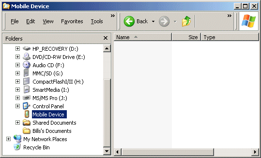
Which Way Did They Go?
Developers tend to prefer to hide menus, controls, entire screens and so on, when it is not relevant to a user. This tends to cause a lot of user-frustration, especially if they have used an item in the past, and now can not find it on the user interface. You can choose to Hide these elements if they are not context-appropriate, rather than hiding them. This shows confirms for the user where the element is (so that they don't continue on to waste time searching for it); and it also let's the user know that, in this context, the element in question is not appropriate. Making things Easy for the user, rather than the developer, results in a better overall experience for the users of your applications.
6. Thou Shalt
use the Right Data Selection Controls. ()
One of the things that can be hard to decide when
designing a screen, is when to use radio buttons, list boxes, or combo
(drop down list) boxes for your users to make selections from.
The rule of thumb here is, that if there are 3 or less items to select
from, use a set of radio buttons to allow the user to make their choice.
If there is Less than a screens' worth of information to select from,
use a drop down list instead.
If there are more entries to choose from than can fit on one screen
-- then use a list box so that the user can scroll back and forth
to make their choice. When using a list box, set it up so that the
user can enter the first character of an entry to jump to the section
that it is in, especially if there are a large number of entries to
pick from.
For extra credit? Consider adding MRU (Most Recently Used) lists to your application, which keeps track of the entries most frequently chosen by individual users and presents these as the user chooses items from a list. Allow the user to clear the list if they desire.
7. Thou Shalt
Check before Deleting. ()
Prompt the users of your application, after they've
chosen to delete a record, to ask if they are sure that they want to do so.
Providing a "Are you sure you wish to
delete [and display the record's name or other meaningful record identifiers here]? followed by a (Yes) (No)" prompt, gives the user a second chance.
You will find that this reduces the number of frantic "HOW Do I Undelete a Record?!?!?" customer calls to your support line.
For extra credit? Provide a few levels of undo on screens that accept blocks of text entry.
8. Thou Shalt let Icons be Icons. ()()
Webster's defines Icon ('Ikân) as a graphic symbol (usually a simple
picture) that denotes a program or a command or a data
file or a concept in a graphical user interface. The reason that there is an icon in the first place, is to make it Easier for the User (hmnn, have I said that before?) to find the application.
It is amazing to find how often this simple definition is broken by applications, who change their icon's shape, color or image between different versions of the application; between different versions of the operating system; or, even contextually within the application itself, such as after receiving email.
All of this, while cute, makes the application hard to find -- and defeats the real purpose of an icon. Pick something, and try to stay with it.
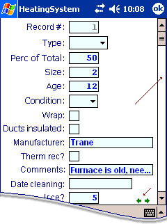
9. Thou Shalt >MARK< Required Fields. ()
Common, you can admit it. You hate it when, after filling out a form or screen and tapping submit, that you are thrown back onto the same screen to fill out fields that the application deems are required. You can also admit it, if you hate it just a little more when these fields were not marked as being required in the first place.
Save your users some time. Make it Easier-for-the-User, and show them what is required.
There are a lot of ways to accomplish this, and here are just a few. Add a small arrow at the end of a required field. Or add an asterisk in the label name before the field.
And for heavens' sake, don't prompt the user with each item that they failed to enter one-dialog-box-at-a-time after they submit a screen. Show them everything that they've missed in one long message dialog. Then immediately place them into the first required field that they missed as soon as they respond to your warning dialog. This saves the user from having to tap/negotiate their way back to the field.
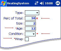
Marking Required Fields
10. Thou Shalt Recognize that all Pocket PC Devices are not the Same ()
Have you seen the Fossil Wristwatch Pocket PC yet?
There are Mobile 2003, Smart Phone, Pocket PC 2002, Pocket PC 2003 devices and more. Each of which has differing screen sizes, methods of input and even different applications loaded into the device by default. And this does not begin to consider previous WinCE versions, or applications that you may wish to deploy across varying software platforms; like Adobe Acrobat, web forms and other types of PDAs.
Our world is complex, and becoming more complex. Put a little time into considering how your application will look if it is run on these different versions, as well as how it will work on them. For example, the Smart Phone version doesn't have a stylus, or even a touch screen. How does that affect your application? You may not care today -- but it does not hurt to consider this before building/buying, so that you at least have an answer ready for the user who does try to run your app on a somewhat incompatible device.
For extra credit? Along the same lines, the use of sound/voice can be cool, but make sure that all devices that may be running your application have the required support, before deciding to incorporate "noise"...
Submit-a-Tip
To make this a dynamically increasing set of ideas, I have
provided a place for you to enter your thoughts on user interface
tricks and design. Submissions will be included in the online version of this article (www.fundamentalobjects.com/articles). Please supply your name and email address and they will
be included with your tip.
e-mail
us a User Interface thought or tip
USER TIPS SUBMITTED
Francis Rabuck
frabuck@att.net
Here's a tip that helps the performance and is often overlooked. Closing
windows on the PPC platform is different than the desktop. Closing a window
at the desktop level, generally closes & shuts down the application. There
are 2 ways to close a window on PPC. OK and X. Using the OK control releases
the application from memory. Using the X will simply close and hide the
window, but it is still "running" in memory. Users can close these open
applications, but only through a complex series of steps. Make it easy on
them and set the window close property to OK, so they don't end up with
memory problems later.
|
Rich Hawley
dinfo@charter.net
Thou shalt consider the h/pc world of users. If software designed is limited to a maximum height of 240 pixels, oftentimes no conversion or extra coding is required to work on handheld pcs such as the Jornada 720, or Mobilepro 900. Of course a program that maximizes all the screen of an h/pc device is really nice, but not always necessary. I have some programs written for pocketpc that run just fine because the author made sure that it fit within my screen limitations as well.
|
Ricardo Menezes
mobilezone@mobilezone.com.br
It´s pretty clear that the decision between scroll/page styles is crucial
for the whole. Me and my work fellows (at Invision) have discovered that, when working with the scroll format, that it helps to put strategic anchor.links along the page. For example, at the end of the page, put a link to the top. Or a menu at the top of the
page, with
anchor links for the sections below.
I think this could be a 11th commandment or so.
|
Related Links
U.S. Department of Health and Human Services Usability
http://usability.gov/
eMail lists, that you can subscribe to for more
information (or to ask questions!)
http://www.uiweb.com/other/chiweb.htm
Wide selection of UI thoughts
http://www.chesco.com/~cmarion/Design/UIDesign.html
(History)
Common User Access; A consistent and usable human-computer interface for the SAA environments
http://domino.research.ibm.com/tchjr/journalindex.nsf/0/7521b9eb651768a185256bfa00685bf2?OpenDocument
http://domino.research.ibm.com/tchjr/journalindex.nsf/0/569afd3b353df16985256bfa00685c8c?OpenDocument
ProContext User Interface Style Guides
http://www.procontext.com/en/guidelines/style-guides.html
Bio
Bill Shadish is a principal of Fundamental
Objects, Inc.; where he works on client partnerships and handheld
technology. Bill writes for a number of industry trade journals. He can be contacted here.
