|
Overview
by Bill
Shadish
This article is for those who are creating new
handheld ("mobile") applications. The intent is to give you some things to avoid and watch out for when building new applications. While our focus will be on Android user interface issues; much is the same in the worlds of
iOS, Linux and related-devices; simply due to the relative sizes of the interfaces involved.
When presented with a new hardware or software platform, it is quite common
to find that --if allowed-- developers will tend to use every bell and whistle available to
them. Many of the following points will serve to temper that so your application is easier to use and has less of Microsoft Clippy-like things.
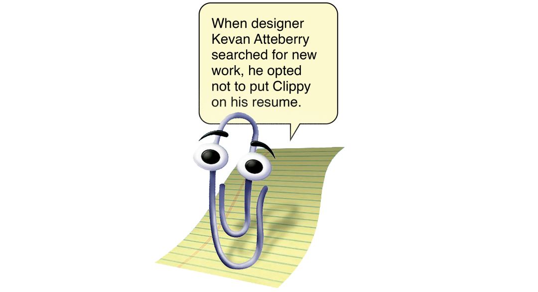
Clippy
In the Beginning
Long ago -- IBM defined Common User Access (CUA) guidelines to provide
a standard for developers to follow when designing screens. Long since
co-opted into other vendors' products, many of the good points of CUA can assist
us today. For example, one of the CUA standards requires a developer to
pop-up a Dialog Box (confirming the user's intentions), whenever the user
tries to delete a record. There are thousands of users over the years
who were Quite happy to have had a second chance to change their minds
as a result of this standard.
The following is a suggested starter set of guidelines to use when designing mobile applications. The list is Not exhaustive. In fact, there is an opportunity
below for anyone reading this to provide additional thoughts on this topic.
May nothing but highly usable handheld applications be the result!
1. Thou Shalt Use Only a Couple of Fonts (and Make Them San Serif).
|
Ah, this is the first place that developers head
for, when playing with a new environment. You'll see italics; 3 or
more sizes of fonts; bold fonts; normal fonts; humorous fonts -- more
fonts than you can shake a stylus at.
A good rule of thumb is to use no more than 2 font sizes on screen
and preferably only one; using bolding to differentiate between types
of fields. It is also fine to have one separate very small font for
things like copyrights, at the bottom of your pages.
Note: If your developers come to you and suggest using 3rd
Party add-in fonts (which means your having
to install and support them on the eventual downstream users' handhelds, among other issues), trust me; and just say No. Go with what the
platform supports directly, such as Android's 'Droid Sans'.
Also, while speaking of "Sans", consider using Sans-Serif fonts rather than Serif fonts as they are easier to read at handheld screen sizes.
Droid Sans is A SANS-SERIF FONT
Times New Roman is A SERIF FONT
figure 1—San-Serif vs. Serif fonts
The Serif fonts have small "enhancements" or flares that come off of the ends of the main font-stroke, such as on the T, N and R in figure 1. In fact, these enhancements are on all serif characters except the O and Q. Also, serif fonts will show a thinner and a thicker portion of the main font stroke, as shown by the T and N above.
Sans(meaning without these things)-serif are more uniform and don't blur the characters with unnecessary "enhancements"; especially when being shown at a small font size.
|
|
2. Thou Shalt
Remember That Small Graphics Should Be Simple.
|
Let's face it -- Companies put a lot of money, er, effort into things like their logo, explanatory graphics and branding. That said, companies will want to reuse these graphics on the small screen as well.
You will need to simplify original graphics or re-create smaller-sized graphics that convey the original, as well be meaningful to mobile users.

figure 2—NHL Coyotes logo.
Regular and phone-sized..
If you never have seen the left Coyotes logo before, then you'd never know what the little one on your smartphone was. The same holds true for any corporate image that is shrunken beyond comprehension for mobile use.
|
|
3. Thou Shalt Allow
Chubby Fingers to Operate Your Touchscreen App.
|
We know that a stylus can often be used to operate a mobile device.
This allows you to click on a relatively small area of the interface.
This fact has given many developers an unwritten go-ahead to jam and
pack as much as possible onto a given screen.
Beyond creating an unwieldy looking screen that can send folks into
a cross-eyed fit, it also prohibits users from doing the unmentionable
(that is, to use their fingertip to select things on the interface).
Consider this in your design, possibly by running through a version
of all your screens using only your finger(s).
A byproduct of this is that you will get uncluttered screens along the way.
|
|
4. Thou Shalt
use Only a Couple Colors.
|
This is the second place developers turn to, when
tuning up their skills on a new platform. Expect to see Colors, colors
and more colors in the first iterations of applications.
More than 2-3 colors of text on any screen (including black), tends
to confuse users more than helping them. The very same limit (of the
same exact two to three colors) should be enforced across your entire
application -- and possibly across your entire line of products.
Tip: Remember that there are color blind customers in the real world.
Color blind customers would also like to be able to use your mobile applications. If you
count on colors to differentiate sections of the screen, you
may be "disenfranchising" the color blind user. |
|
5. If Thy
Application is Cross-Platform Use Native Controls.
|
...even if your app is not cross-platform, still use native controls.
Cross-platform here means that your app has versions for iOS as well as on Android. Or maybe even for Linux, Macs and Windows too.
Native controls means using the list boxes, buttons, radio buttons, text boxes and other related widgets as directly provided by the platform itself — and not "emulated versions" as provided by some development tools.
So, what are "emulated versions"? These are controls that are provided by 3rd party libraries or the development tool itself, to replace using the native controls of the operating system -- like Android. This is done for a number of reasons (see figure 3), but includes making it easy to create cross-platform apps. If the dev tool itself with how a control like a button is shown and works, then they don't have to worry about handling the actual differences in buttons between the various platforms. BUT the dev tool's button will likely look and work in a non-standard way on All platforms.
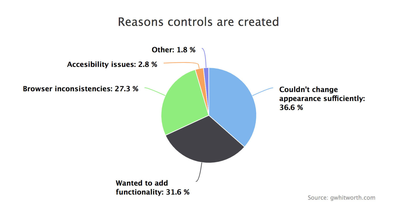
figure 3—Reasons to create your own controls
It is somewhat harder to use native controls, because individual effort is required on each of the platforms that you'll support, instead of just once — but try to use native controls as they will match what the user is used to working with.
|
|
6. Thou Shalt
use the Right Data Selection Controls.
|
One of the things that can be hard to decide when
designing a screen, is when to use radio buttons, list boxes, or combo
(drop down list) boxes for your users to make selections from.
The rule of thumb here is, that if there are 3 or less items to select
from, use a set of radio buttons to allow the user to make their choice.
If there is Less than a screens' worth of information to select from,
use a drop down list instead.
If there are more entries to choose from than can fit on one screen
-- then use a list box so that the user can scroll back and forth
to make their choice. When using a list box, set it up so that the
user can enter the first character of an entry to jump to the section
that it is in, especially if there are a large number of entries to
pick from. |
|
7. Thou Shalt
Check before Deleting.
|
Prompt users of your application, after they've
chosen to delete a record, and ask if they are sure that they want to do so. Providing a "Are you sure you wish to
delete [and display the record's name or other identifier here]? (Yes) (No)" prompt, gives the user a second chance.
This also
produces the happy byproduct of reducing the number of frantic "HOW Do I undelete a Record?!?!?" support calls to your office. |
|
8. Thou Shalt Really, Really Watch Your Connections
|
If your application moves data back and forth to a server, or to the cloud (which is just someone else's server) it is beyond critical to monitor your connection to it.
This is probably the most difficult thing to do in a mobile app. The connection can weaken or drop completely because the phone moves out of cell tower range; or if the user enters a large building (think: Costco) or even if the user just moves between the rooms in a house. The connection provider could have a "hiccup" or be fully down because of a snap storm. Even a smartphone battery could die.
Your app needs to ensure that the data will not be affected in any way. No partial transmissions; or garbled transmissions. Never, ever, lose data.
Make sure that the app developers provide logging of the transmission process, preferably in a way that you can easily monitor. Also make sure that the data transmission process is tightly wrapped with good error handling, and make sure that there is bullet-proof error handing on the user side. For example, by providing actually helpful messages to the user in the event of any problem; that clearly explains what happened and what to do (including exactly who to contact) to correct any type of issue.
|
|
9. Thou Shalt be
Wary of the other Devices before Ye.
|
Yes, Android does have 74% of the handheld market today
[reference: counterpointresearch.com]. However, history has shown us that things change.
It would be prudent for those who are developing applications today
to be very mindful of this.
One thing that you can do to protect yourself, is to have your developers
understand Both the iOS (23%) and the Android platforms. And perhaps even the (now at 4%) HarmonyOS from Huawei. It is not outlandish to have them create small example applications that demonstrate their
ability to write code, that is at least possibly portable to other
platforms. This is not an unreasonable thing to ask for when building
new handheld products today.
Ask your developers to create very small code modules to handle individual
functions. The smaller the modules, the more easily that they can
be ported if it becomes necessary to do so later on. |
|
10. Thou Shalt (at
least) Consider Foreign Language Support.
|
If dictionary applications taught us anything ;-),
it was that by providing support for multiple languages, that you
Can increase your market. This does not mean that you Have to include
German/French/Spanish/etc support today. But, know that there are
ways to construct applications, that do allow you to more readily
add support for other languages in the future. Make sure to ask your
developers what their plan is to handle this down the road.
Verstehen Sie? |
|
Submit-a-Tip
To make this a dynamically increasing set of ideas, I have
provided a place for you to enter your thoughts on user interface
tricks and design. New Ideas that add something to this page will be included
in this section. Please supply your name and email address and they will
be included with your tip.
e-mail
us a User Interface thought or tip
User Tip
submitted by: Andy Dent, Australia
- If you are designing an app which you particularly expect will be
used in an airplane make it forgiving of shaking hands.
(an old tip from Apple HI people for laptop design).
This may imply:
a) larger target areas,
b) extra Undo or more acknowledgement dialogs,
c) more tolerance of sudden jerks of the stylus if there
is a drawing aspect, effectively running a smoothing
algorithm.
Maybe even a special "in air" mode is needed?
- Seconding the tip about using thumbs - remember the poor soul
who just dropped their stylus and don't trap them without being
at least able to finish an operation without one
(ie: if there are important buttons to press make them fingerable).
- Tip #1 applies even more so if your target audience is
aging or people with illness affecting motor control.
|
Bio
Bill Shadish is a principal of Fundamental
Objects, where he works on client partnerships and handheld
technology. Bill writes for a number of industry trade journals; including
Energy User News, Home Energy Magazine, Inside Visual Basic and Visual Basic Developer. He can be contacted at foAudits.com.
|
|

